a doll’s house, part 2
JUNGLE THEATRE, Regional Premiere, Director Joanie Schultz Scenic & Projection Design Chelsea M. Warren Costume Design Mathew Lefebvre Lighting Design Marcus Dilliard Sound Design Sean Healey Properties Manager John Novak Production Photography Lauren B. Photography
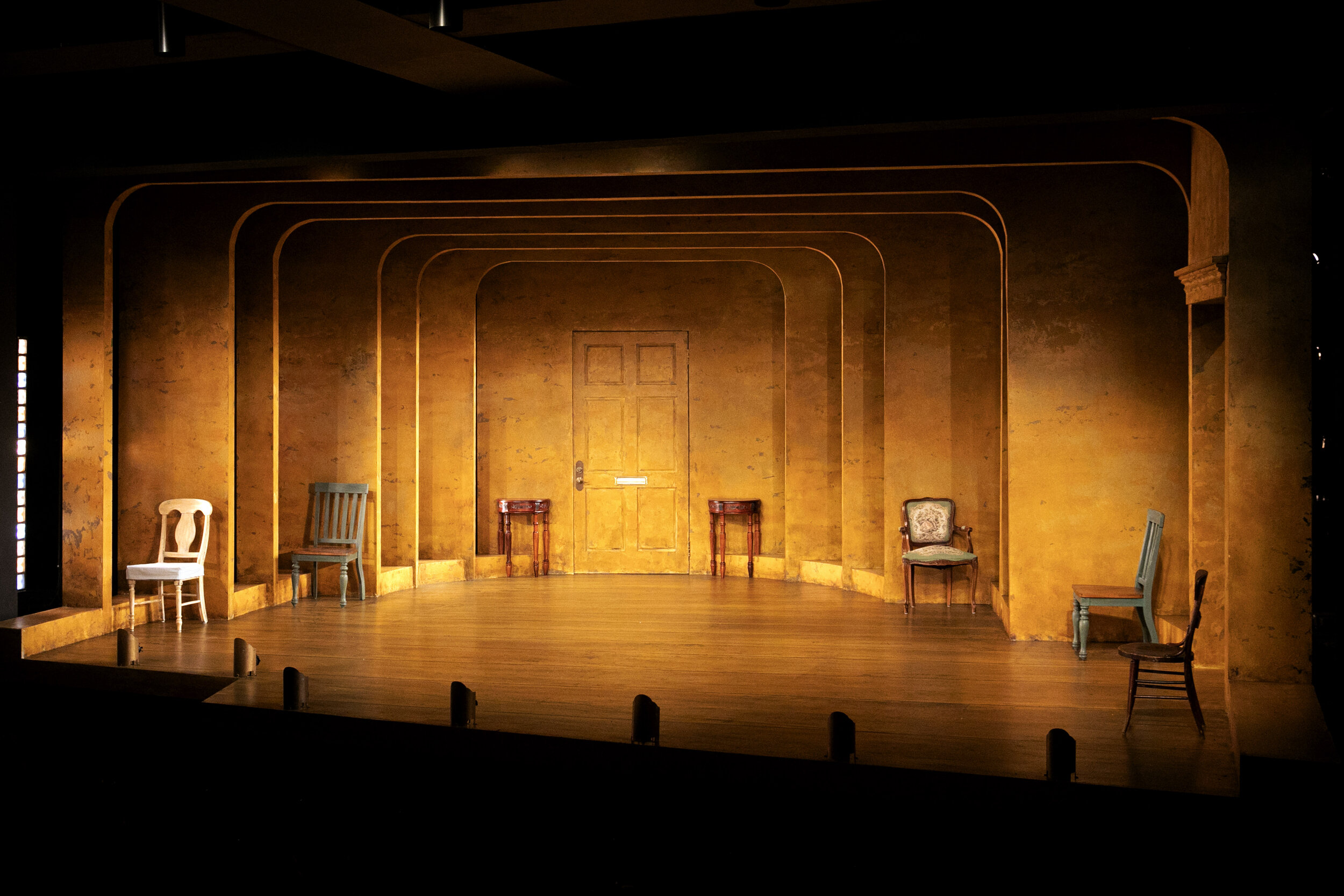
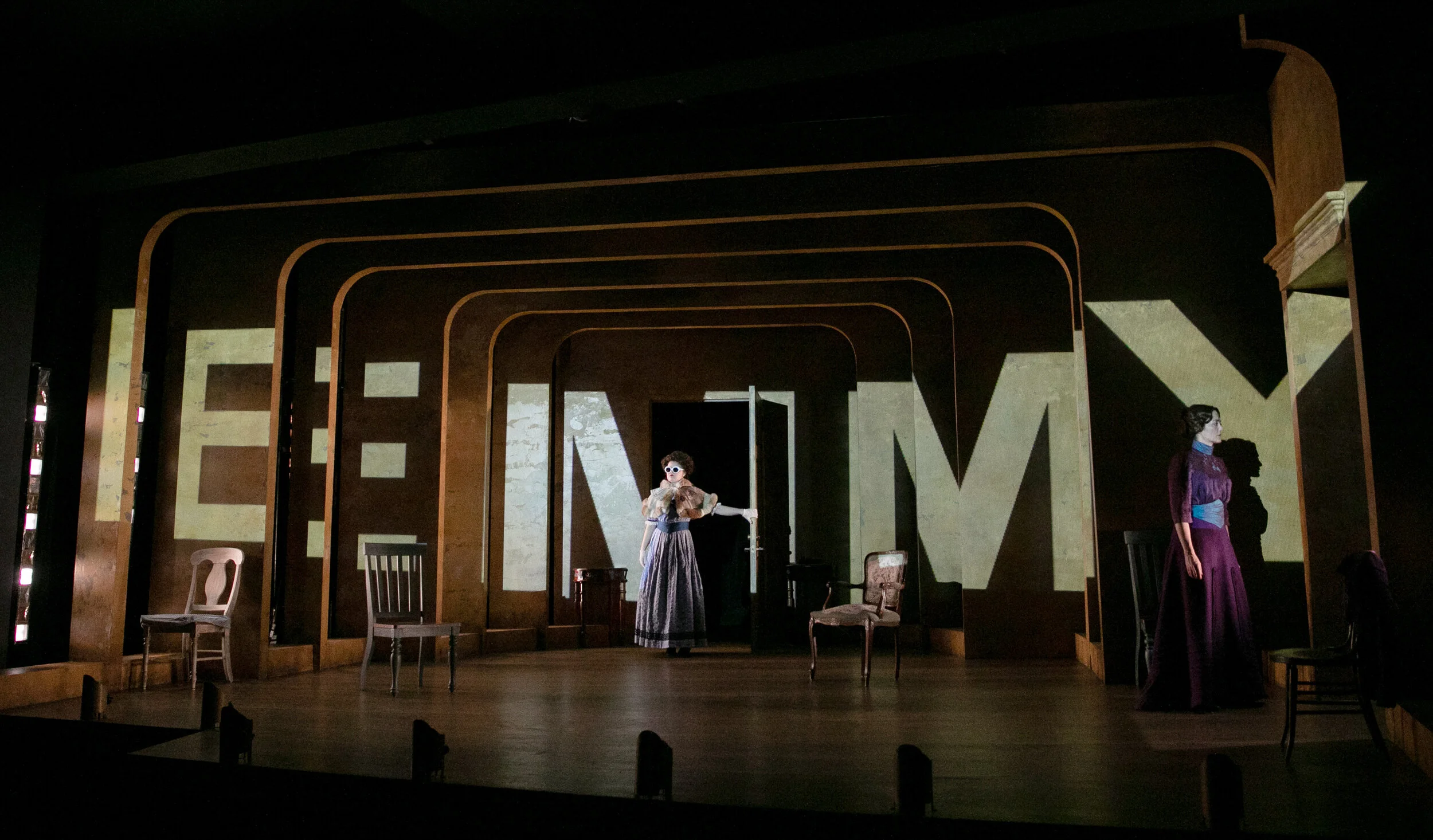
OVERVIEW: The design takes place in a Norwegian Victorian entry room with a portentous door at the home of Torvald and previously Nora, before she left 15 years ago. Scenic requirements include a door to outside, an exit to the rest of the house, multiple chairs and an open yet commanding space. On A Doll’s House, Part 2, I worked with frequent collaborator director Joanie Shcultz to create a deconstructed Victorian room projecting out into the audience counterbalanced by a heavy foundation at the perimeter and modern technology peering in. This play asks the question of where are we now, 141 years after the initial production of A Doll’s House. How different are gender roles within marriage today? Is Nora correct, is the structure of marriage confining us?
*see ADDITIONAL MATERIALS & REVIEWS/FEATURES below
ADDITIONAL MATERIALS
REVIEWS/FEATURES
BWW Review, Karen Bovard: “Scenic designer Chelsea M. Warren devised a smart, spare set of enclosing, receding arches with just a few simple period chairs leading to the notorious door, off center up stage.”
Twin Cities Arts Reader, Bev Wolfe: “All of the action occurs in the entryway, by that same door where Nora made her original exit. Chelsea M. Warren’s set design aptly shows a 19th-century upper-class home that has seen better days. Chairs are lined up on each side, but are not necessarily matching. Mathew J. Lefebvre’s costume design also contributes to the ambience of the time period with little touches such as Nora’s success reflected by her stylish dress.”
Play Off The Page, Mary Aalgaard: “The set (design by Chelsea M. Warren) of A Doll’s House, Part 2, looks, to me, like a pop-up book. Like you could press it down, fold it up, and take it with you. The only furniture is a scattering of a few chairs and two small tables near the door. I kept looking at the one that had a shorter leg, and thinking, that’s an interesting design. Although, the setting of the play is around 1896, they use some contemporary elements. You have period looking costumes (by Mathew J. Lefebvre), but with bold, modern colors, or a loosing of the restrictions, like when Torvald nearly tears himself apart in frustration with his wife. They also use projections and modern lighting (Marcus Dilliard) on the layered and yellowing walls, and include modern music (sound design by Sean Healey). All of this makes for an interesting juxtaposition of the past and present. It’s like they made a movie that came to life.”
Talkin Broadway, Arthur Dorman: “Chelsea M. Warren provides the play a handsome stage design with rounded-off frames setting off the open stage, receding to the rear wall where the omnipresent door awaits passage.”
The Stages of MN, Rob Dunkelberger: “The direction by Joanie Schultz is bold. There are music and projection choices that scream 2020, but they work, without taking us out of the period of the play. Everyone behind the scenes has done a great job with this production, the Scenic Design by Chelsea M. Warren is spare but effective and fitting for the script. This is a play that focuses on the interaction between the characters, we do not need a fully dressed set to bring these characters world to life. The design works perfectly with the text projection that appears throughout the performance.”
Minnesota Playlist, Erin McNeil: “Chelsea M. Warren’s pointed set creates a cavernous, hall of mirrors effect. Many concentric rectangles lead to the all-important door, giving the entryway/drawing room an expectant, unstable feeling. Nothing exists in the rooms except chairs, more evidence that Torvald was unable or unwilling to replace Nora.”
Single White Fringe Freak: “Even the little things can stand out on a blank canvas like this. One visual that grabbed me was the little end tables on either side of the imposing door in the center of the back wall. As part of Mathew J. LeFebvre’s wonderful costumes, both Nora and Torvald each have a hat. Over the course of the action, these hats are removed, and placed on each of the end tables framing the door. A symbol of a man, a symbol of a woman, separated by a door, just sitting there. Lovely. Just a little touch. You can see it, or not, but it’s there, while the scene between the characters takes place in front of it. The whole production of A Doll’s House, Part 2 is full of these grace notes.”
MplsStPaul, Brett Burger: “The Jungle Theater has such an intimate stage and space that I can’t think of a better space to bring this story to life. The set, designed by Chelsea M. Warren, does exactly what it needs to do, letting the story and performances shine. I admire that they didn’t try to make this extravagant entryway of a house with unneeded set dressings. What is needed is the performers, some chairs, and of course the notorious and symbolic door.”
Twin Cities Stages: “The direction by Joanie Schultz makes the story feel modern and cinematic, while still feeling that it takes place at the end of the 19th century. The scenic design by Chelsea M Warren is an empty room, framed by arches, and scattered with chairs at its perimeter. Its openness allows for the dialogue to be the most attention seeking part of the show. It also serves as a backdrop of the lighting by Marcus Dilliard and Sound Design by Sean Healey.


